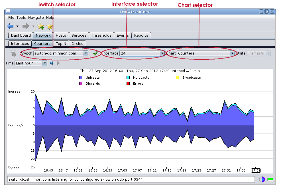
Interface counter charts show how the overall network traffic load on an interface varies over time. These charts are generated from the interface counter data exported by sFlow. Interface counters charts are represented as stacked area charts.
This tab includes a control bar that allows you to select the
switch (Section 3.5, “Selecting a switch”) and interface
(Section 3.6, “Selecting an interface”) for
which you would like to view
trends in counter values, the counters charts to display and
the specific time interval (see Chapter 9, Selecting a time period  ).
).
![[Note]](img/note.png) |
Note |
|---|---|
When you have made changes to the selections for the chart, you can save these selections in a bookmark (see Section 1.4, “Navigating around sFlowTrend-Pro using the history navigator”) so that you can easily return to the same chart at a later date. |
With sFlowTrend, or with sFlowTrend-Pro when the
Time
setting is relative to now (for example
Last hour
see Chapter 9, Selecting a time period ),
these charts are automatically updated when the next data
point is available. The Progress indicator shows how long it
will be before the chart is next updated.
The following charts are available:
- Utilization
- This chart shows the utilization trend for the selected interface. The utilization chart is useful for identifying any capacity problems with the interface. If utilization approaches 100% for sustained periods then action should be taken to increase the capacity of the link, reorganise the topology of the network, or limit the applications making use of the link. Change to the Top N tab and use the Top sources chart with Units selector set to Bits/s to start diagnosing the major sources of high utilization.
- Counters
- This chart shows basic interface counters. The counters chart is useful for examining the number of errors, broadcasts, multicasts or discards on an interface. High error rates can indicate a bad cable or interface card. High discard rates may indicate that the device cannot keep up with traffic. Change to the Top N tab and use the Top broadcasts or L2 multicast flows with Units selector set to Frames/s to help identify sources of high broadcast or multicast traffic.
- WAP frame counters
- This chart shows the trends of 802.11 wireless fragments and multicast frames.
- WAP control frame counters
- This chart shows the trends for 802.11 wireless control frames: Request To Send Success, Request To Send Failure, Acknowledgement Failure.
- WAP error counters
- This chart shows the trends for various different types of 802.11 wireless error frames.
- WAP associated stations
- This chart shows the trends in number of 802.11 wireless end hosts associated with the selected radio interface.
- WAP QoS counters
- This chart shows the trends for various different types of 802.11 wireles Quality of Service counters.
|
Note |
|---|---|
The WAP counters charts will only display data if sFlowTrend-Pro is receiving sFlow from wireless devices that support the sFlow 802.11 Structures |
When the Utilization chart is chosen, the Units selector automatically changes to Bits/s, and cannot be altered. The chart left y-axis indicates bits/s while the right y-axis indicates % utilization of the link bandwidth.
When the Counters chart or one of the 802.11 wireless counters charts is chosen, the Units selector automatically changes to Frames/s and cannot be altered.
Sometimes the valuse for one interface counter can be much smaller than the values for other counters, making it hard to see the trend for the smaller counter. In this case, you can view the trend for only one interface counter, by clicking on the legend item corresponding to the counter of interest. For example, when viewing the Counters chart, clicking with the mouse button on Errors will change the chart so that it displays only the trend for errors; an additional trend line for discards can be added to the chart using Shift+ mouse button on Discards; or clicking with the mouse button on Errors or the background of the legend area will cause all trend lines to be displayed again.